Like many of you, my first introduction to Le Corbusier was via James C. Scott in Seeing Like A State, in which Scott eviscerated Le Corbusier’s planned cities as the pinnacle of “high modernism”: a governing philosophy that imposes a top-down “administrative ordering of nature and society.” So I was naturally intrigued when Noah reached out with a pitch to redeem Le Corbusier, at least as an architect, if not a planner. Gotta say: I’m a convert.
Noah’s essay asks why modern architecture is so ugly, then prompts a path forward for an “architectural futurism.” Architecture is one of the oldest technologies and art forms around, and you’ll find that design lessons from the millenia-old craft of architecture have relevance for anyone trying to unite beauty and function in their work.
— Jasmine Sun, Reboot Editorial Board
The Concrete Oasis
By Noah Putnam
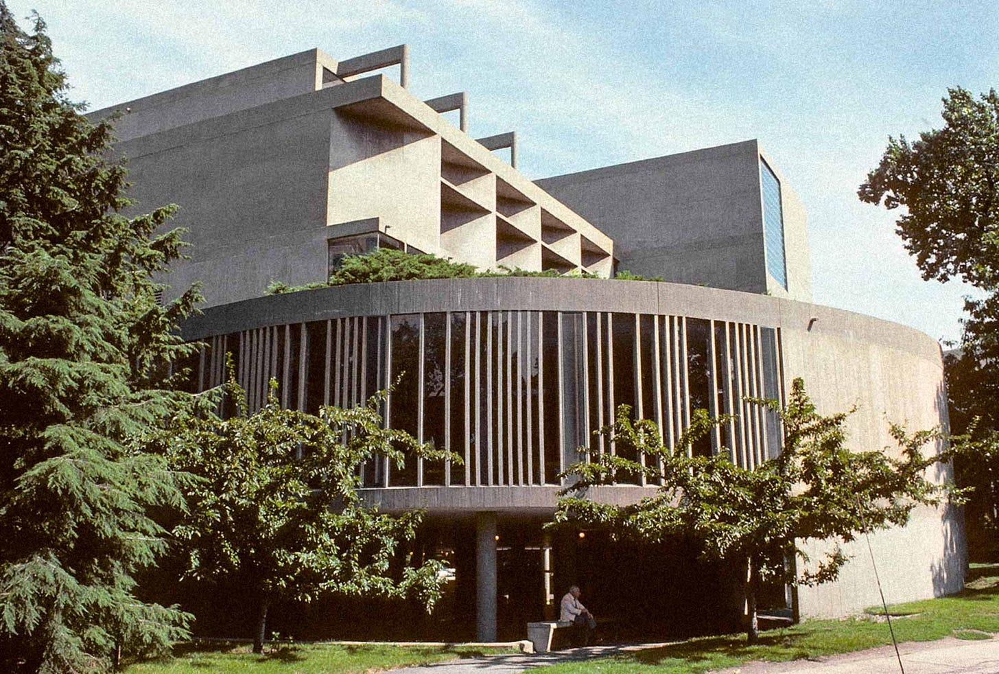
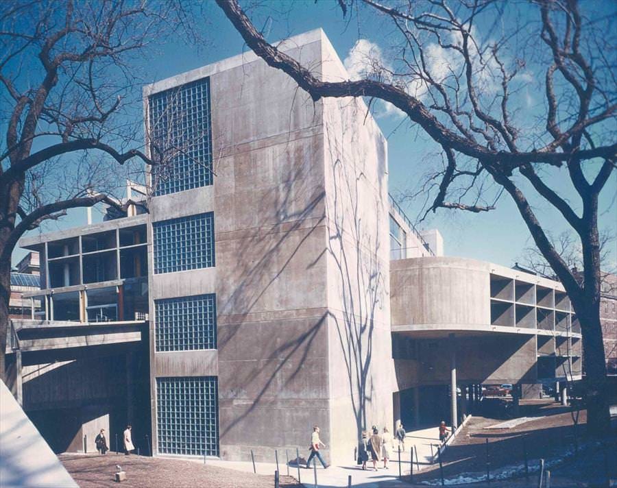
If you ever want to smoke a cigarette in Harvard Square, there’s only one right place to do it. Located half a block down from the Fogg Art Museum, the Carpenter Center is impossible for you to miss: it is the only building within half a mile that looks like it was built after the Revolutionary War. The center is a constructive conundrum, a concrete albatross nestled in a city of brick—and a vital signpost for the future of our architecture.
Admittedly, this endorsement may seem dubious at first glance. The Carpenter Center appears on the street like an alien object, slate-gray and artificially smooth. Its concrete design, formed out of a mishmash of rectangles and curves that jut out from a central five-story edifice, looms over pedestrians as they walk by it. Upon the building’s completion in 1963, a critic in The New York Times remarked that the structure “violates the street and scandalizes the neighborhood.”
But the notoriety of the Carpenter Center isn’t limited to its stark appearance. The center is the only building in North America designed by the Swiss-French architect Le Corbusier, one of the early pioneers of the school of modern architecture, and an infamous name in many urbanist circles.
Le Corbusier became widely known during the mid-20th century for his modernist approach to urban design. The core of his philosophy advocated for cities to recast their layouts and buildings into radical new designs adapted to the innovations of the modern age—while paying little attention to what their current residents thought about these changes. It was a new theory of urban revitalization that became highly influential amongst city planners and policy makers of the time, often to disastrous effect. Le Corbusier’s ideas have been blamed for inspiring the community-destroying slum clearance and public housing policies of the 1950s, as well as a whole host of problems—off-putting brutalist buildings, atomized living places, car-centric infrastructure—that plague our cities to this day.
And yet despite all of this, I still can’t help but love the Carpenter Center.
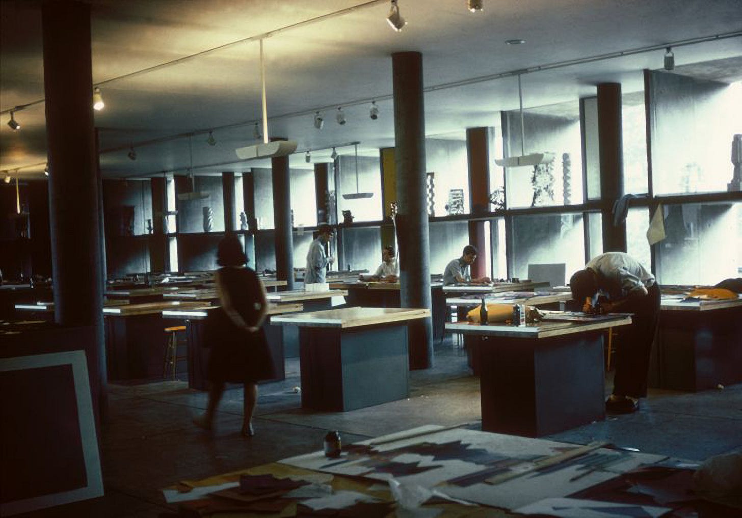
The building is flanked by dual ramps, running along its front and back faces, which stretch out to the sidewalk and invite you upwards as you approach it. The ramps go on to climb up 10 yards above the foundation, and then crest together at a flat hallway that tunnels through the central three-story art studio. Here, the architecture breaks open as large windows appear to each side of the hall, allowing you to peer in at the students at work, and the creations strewn about the studio’s cavernous rooms.
Outside of its central pathway, the center offers many secluded corners to dwell in: patches of grass cordoned off from the road, subterranean crevices between its support columns, a rooftop garden that looks over the steeples of nearby churches. It’s possible to walk in the loop cut by the building for hours without noticing. The architecture allows you to move fluidly throughout, pacing from ramp to ramp and space to space without registering any discontinuity, lost in pondering thought, and yes, if you are so inclined, puffing on the occasional dart.
The Carpenter Center manages to be simultaneously public space and private refuge. Moving from the crowded streets of the square to its muffled passageways feels like stumbling upon a clearing in a forest with a perfectly shaped boulder to lie down on.
Now I am no pollyanna on the state of contemporary architecture. I agree that today’s buildings are, as a general rule, ugly and cheerless. Witnessing the most egregious of contemporary constructions—the ROM Crystal in Toronto, the Tour Montparnasse in Paris, the City Hall in Boston, etc.—is usually enough to make me question modernity altogether. The proliferation of these buildings easily leads to a peculiar feeling of paranoia, like, as a 2017 Current Affairs essay, “Why You Hate Contemporary Architecture”, suggested, “some unseen person or force seems committed to replacing literally every attractive and appealing thing with an ugly and unpleasant thing.” This kind of opinion is far from confined to high-brow magazines. Indeed, in our hyperpolarized society the one thing everyone seems to agree on is that the new buildings suck.
However, what criticisms of contemporary architecture have so far failed to do is satisfyingly answer the question that naturally follows their conclusion. If the architecture of the present has become irredeemable, then what is the architecture of the future?
Architecture is arguably the most intimate of the arts, one that we do not just spectate and consume but inhabit and live our lives within. It is certainly the most public art form: no matter where you are in human civilization, you are constantly consuming the architecture of your environment, breathing it in alongside the oxygen in the air. This helps to explain how it is the case that seemingly everyone hates the design of contemporary buildings and yet developers keep building them. Architecture is not an economic commodity that can be corrected by market forces, nor an engineering problem that can be honed towards an optimal solution. Architecture is a spiritual ethic, one that both shapes and is shaped by the ambient zeitgeist of the society it stands in.
Repairing this ethic is a task that defies any straightforward approach. Solving it is not a matter of devising elegant theories or highly specified plans, but instead observing what stirs within when you encounter a piece of architecture.
The role aesthetics play in understanding the world is precognitive; it is much harder to lie about beauty than truth. When we see a suburban McMansion designed to imitate some architecture from a previous era, we can still sense its true nature through the cracks in the facade. When we see a hulking apartment block rise up in our neighborhood, no amount of millennial-coded branding can prevent us from seeing that this building cares about nothing except the profits of its financiers. In either case, we can tell that the architecture is lying to us, and can’t help but resent it for that.
A new architecture must tell the truth, both about where we are today, and where we could be tomorrow. It cannot come from striving to recreate an imagined past, nor yielding to the dreary present.
To develop a truly futurist architecture, the only direction we can move in is forwards.

And this brings us back to Le Corbusier, the maligned modernist who so often plays the role of villain in histories written on the past century of urbanism. And to be fair, this isn’t wholly undeserved. As an urban planner, Le Corbusier’s approach was dogmatic, focused on abstract theories of “modern living” to the detriment of the real world experience of the people who make up a city. As a political actor, his ideology was shamelessly undemocratic, if not outrightly authoritarian. However, neither of those lenses captures the principles that truly animated the man. Le Corbusier was, above all else, a technologist.
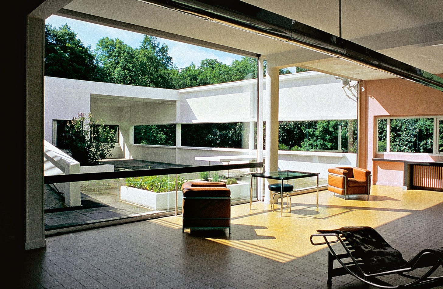
The animating goal of Le Corbusier’s work was to reckon cities and their buildings with the bizarre new reality that the industrial revolution had recently thrust humanity into. His “5 Points of New Architecture” revolve around the opportunities that industrial technology afforded new buildings: concrete foundations elevated above the ground, wide-spanning horizontal windows unburdened from the needs of thermal regulation, rooftop gardens and terraces along the reinforced surfaces; everything opened up to sunlight and the comforts of modern living.

But to Le Corbusier, an architecture for the modern era was about more than just building materials. It was about capturing the frenetic spirit of the times he lived in, and shaping it into structural form.
Le Corbusier had little faith in the contemporary European architectural establishment to accomplish this task, believing them far too stifled by tradition to meet the challenges of the new era. Instead, he counseled architects seeking inspiration to look overseas, to the American engineer. With the technology coming out of America in the early 20th century—the factory, the steamship, the airplane, the automobile—lay the vitality of the industrial age. It was in these inventions that Le Corbusier believed a new ethic would be found.

The architecture of a civilization is always in communion with its technology. Its effects are deeper than just the immediate appearance of buildings: the process of technology colors everything about how a culture interacts with the world. In the early 20th century, the mathematical rationalism of inventors and engineers intermixed with the wealth-fueled optimism of industrial capitalists to create a collective technological spirit that permeated society. It was this spirit—seen in movements like Italian Futurism, Streamline Moderne, and Le Corbusier’s International Style—that defined the architecture of the era.
For today’s culture, no building better demonstrates this process than the recent development—and subsequent phenomenon—of Las Vegas’s Sphere.
Over the past 50 years, industrial technology has been abstracted away from us, as the “tech industry” has steadily narrowed to refer only to the computers we use to communicate and entertain ourselves with. But what is special about The Sphere is that it brings our software-mediated existence to life in the physical world. Its outer shell, 366 feet tall and tiled across with over 1.2 million LCD panels, essentially amounts to one gigantic computer screen, able to take on any form you could think of: a globe, a basketball, a smiling emoji, an explosion of fireworks.
The Sphere is a building that would have been impossible to imagine at any era in history before the present. It is uniquely ours to take pride in—but it also challenges us. It forces us to see the digital technology that has come to dominate our lives in a newly solid—perhaps even friendly—form. Through The Sphere, the smartphone screen is recast, from an isolating portal to a public spectacle, shared throughout the city. The architecture charts a new future, a new possibility for our relationship with technology—one we could make actual, if we are bold enough to grasp it.
As Le Corbusier wrote in the opening to his manifesto, “Our own epoch is determining, day by day, its own style. Our eyes, unhappily, are unable yet to discern it.”
What Le Corbusier understood about architecture is that it must always confront the present. The need for shelter is deeply ingrained in us, that sense of “being at home” that we can always intuit when we feel safe in the place we’re residing. But when architecture falls out of sync with the conditions we live in, home begins to feel more and more precarious. The reason we dislike contemporary architecture is because it fails to achieve this essential purpose, to, as the architect Antonio Sant’Elia put it, “freely and audaciously harmonize man with his environment”.
Our environment, continually disrupted and colonized by technology, demands a new architecture.
Developing it is not simply a matter of coating all of our buildings in LCD panels. After all, while a structure like The Sphere is inspiring on its own, it would undoubtedly feel ungrounding if its designs were scaled to an entire city. This impulse to disregard history and treat all buildings as avant-garde canvases is exactly what has led architecture to its present state of decline.
Yes, architecture must always evolve, but, just as when you are hiking along uneven terrain, one foot has to be planted firmly for the other to move forward. As with a concrete structure made restful, or a digital expanse made physical, a new architecture must achieve a synthesis. Its designs must integrate across both new materials and classical forms, modern machines and natural systems, artificial energy and primordial instinct. With the right architecture, these forces all come together in a building that stands as a monument to why we should still believe in the promise of our age.
It is the kind of building that when entered can make you feel infused with the opportunity of a world very different from the one you used to know. This is the essence of a futurist architecture. It is the ethic to make a building that convinces people they are living in the future.
Noah Putnam is a technologist and critical theorist researching rhizomatics as applied to the internet (and blueprinting a speculative futurist building or two on the side). He also almost got sued by Forbes 30 under 30 one time.
Reboot publishes essays on tech, humanity, and power every week. If you want to keep up with the community, subscribe below ⚡️
🌀 microdoses
I loved this essay about The Sphere in The Paris Review, and I really, really want to go to The Sphere now.
It’s interesting how Seeing Like A State has made it into the vague tech canon, despite being from a random anarchist anthropologist who specialized in Southeast Asian agrarian societies. I was introduced to the book via this Slate Star Codex review, though I wonder more why he became so popular in this scene—the anarchist-libertarian alliance? (Arbitrary trend prediction: high modernism is back; someone’s going to write a viral blog post explaining everything wrong with Scott; the military-industrial / progress-studies / state-capacity faction has mostly beaten the libertarians in Silicon Valley, etc.)
We’re in the heat of the Vibes Election™, which highlights how important aesthetics have become in constructing appealing political visions. I like to return to this 2020 Palladium piece, which argues that if it’s time to build, we need human-scale narratives for how modernity will help us thrive.
Speaking of human-scale: “I want AI to do my laundry and dishes so that I can do art and writing, not for AI to do my art and writing so that I can do my laundry and dishes.”
Overheard from jacob sujin kuppermann: “I want a vice president who has used the ESRI product suite.”
💝 closing note
I have total election brainworms right now, so I’d be very excited to get pitches with strong explanatory angles on meme campaigns, political prediction markets, the triumph (?) of vibes over policy, and other ways that weird new media forms have shaken up the campaign cycle.
— Jasmine & Reboot team


